Home made cellphone project.

Better icons n things..
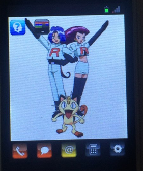
It just seems impossible to get a good shot of this with the white background. At least, cropped like this, you can get some idea on how the little icons look.
Lower icons, Left to right
Phone
Text Msg
Contacts
Calculator
Settings. But now debug.
Upper icons
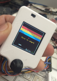
Q game
Breakout.
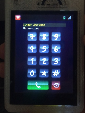
Editable phone number text.
The label showing “No Service” fades to black after about 5 seconds. If an incoming call comes in with a caller’s ID, it is displayed here as well.
The green phone connect button turns to a red hangup button where there is an active connection.
Also, notice the battery level and RSSI bars. As signal goes up, the bars go from red to green. As the battery goes down it goes from green to red.
Very fancy!
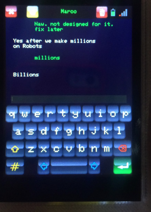
Your standard, type a message, hit return, and out it goes. When a message is sent it shows up on the screen as yellow. If it is successful, it goes green. If it fails to send, it goes red. The red messages are not saved when texting is closed, but the rest of the conversation is saved to disk.
To erase the conversation, click the trash icon on the right. To change to a different conversation, click the yellow icon near the left. And, as always, click the upper left red x for closing this panel.
The message window can be scrolled by dragging on it. (Sort of, still working on that.)
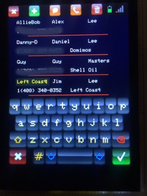
Touch a field to select and edit it. Also having any field selected, will allow you call or text someone by clicking one of the orange icons on the menubar. The trash icon will delete a contact, the green cross adds a new contact.
Notice the keyboard is different than the one on the text panel. This keyboard is modal. Clicking the check mark commits your edits. Clicking the rex x discards your edits. Both deselect all editing fields.
The contacts list can be scrolled by dragging on it. Like above, sort of..
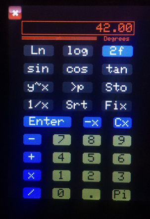
The calculator is historic. This is the sketch that started all this nonsense of drawing to screens. About nine years ago now. WOW!
Its basically an HP calculator from the 70s - 80s. I actually went though the manual of a hp 42S to get the way it worked right. Back then they basically explained all the code algorithms in the user manual. Makes developing your own pretty straight forward. Not that I get their 60 bit calculation accuracy. But this is good enough.
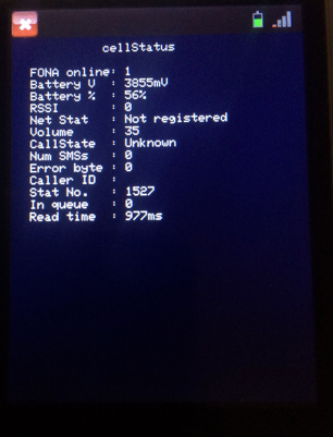
This was slated to the the panel for settings. But.. I really needed a panel showing debugging info. and that’s what this turned into.
At about the end of version two, I was playing around trying to get this to work with a wireless headset. But at that point I didn’t have enough control UI bits to make it easy, so the project returned to the back burner.
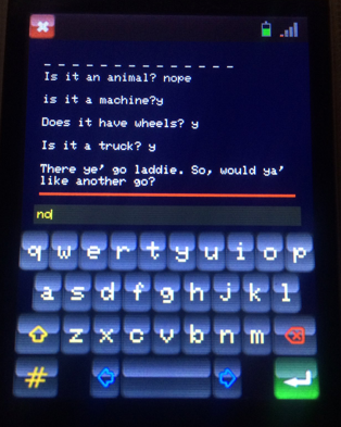
Not much to say here. The keyboard used here is the non-modal one. Just like a standard terminal.
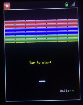
Again, not a lot to say. Kids like this. I notice them grabbing the phone to play it.
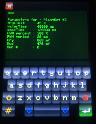
This is my sTerm panel. Its a general purpose panel that I can use to “talk” to my Arduinos over their serial link. It basically takes place of the monitor on the Arduino IDE. Pretty handy.
This panel’s not in the phone. I just thought people may like to see yet another application that can be wrapped into these things.
This is currently running on my plantBot handheld programmer. The plantBot handheld runs floraOS being a derivative of litlOS and a sibling to cellOS.
For the plantBot and version 3, I sat down and rewrote the keyboard to editing field code from scratch. I now have a class called editable that links to keyboard objects.This added to my label class gives me an editLabel that actually “does the right things” It scrolls, it understands Right, Left and Center justifications. It caused no end of grief trying to incorporate it into the contacts panel.
Putting in the new icon based keyboards just made the slow redraw worse. It was to the point that you could click the shift key and count, one one-thousand, two one-thousand three one-thousand... before it finished drawing the keys. I started looking around for possible solutions. What I found was that the Teensy people had a Teensy version of the Adafruit drivers for this screen. So I figured I’d give it a go.
This, of course, was not straight forward. It conflicted with the GFX library over some button code I never used. The #ifdef things that were supposed to mask this stuff for some reason weren’t working. In fact, I had issues with them as well on some of my stuff. Anyway, in the end I just commented the button code out and got everything to compile.
This time the ends justified the means. Everything sped up a bunch. Especially things like fillScreen() or paintRect(). You can tell it to fillScreen() 3 different colors and have a hard time seeing the middle color. Painting my home panel now only takes about a second and a half.
In parallel with this, I’d been working on an offscreen drawing library. It comes with two classes. bitmap, and a virtual display class called, offscreen. You allocate a bitmap, and create an offscreen drawing object. Call offscreen‘s beginDrawing() method with your bitmap and draw as you normally would. Instead of sending all the drawing commands to your display, it draws into your bitmap. When you are done, call offscreen‘s endDrawing() method and your bitmap is all loaded up. Now you can blit this to the screen wherever you want. Like having a stamp. Or..
You can do graphic operations on the image in the bitmap. And those runs really fast! I was playing about doing stuff like making things glow on the screen when you touched them. Fun fun fun! The only down side is that they just wallop RAM. (xPix * yPix * 3) I tried to do a animation sprit but I only got 3 out of 7 frames before I ran out of RAM.
Adding bitmap blitting to the keyboard now has it so that clicking shift takes less than a second to refresh the keys. I’m pretty happy with that for now.
So, what issues do we have left?
