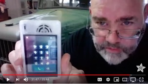
Home made cellphone project.

And what issued do we have here?

Auto layout of added app icons. Right now all locations are hardcoded. That’s just tacky. In fact, the background image is hard coded as well. I should make it user settable.
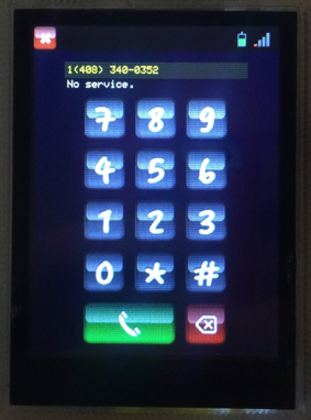
SOUND!! This has been an issue from the beginning and I’ve never been able to solve it. I can NOT get sound to work out of the SIM800 chip.
Sure, you can talk and listen to a call, but anything else?
I spent endless hours messing with this. How can anyone navigate a phone mail system without touch-tones? Not to mention custom ringtones.
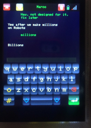
Where to start? It needs a complete overhaul to the list that shows the messages. Some sort of little cartoon bubbles like all the others. Or at lest a better system than the one I tossed together here.
And while we’re at it, lets go over scrolling and get it right for once. Its pretty poor right now, and that bleeds over into text selection.
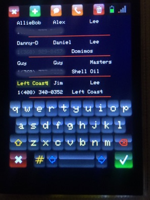
Two panels! One for searching and selecting, one for editing contact info. By the time this is completed maybe scrolling will be rewritten?
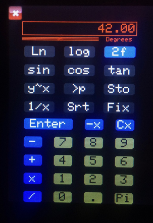
Easy, copy and paste to editing fields on other panels. I sometimes think doing a set of icon keys would be kind’a cool.
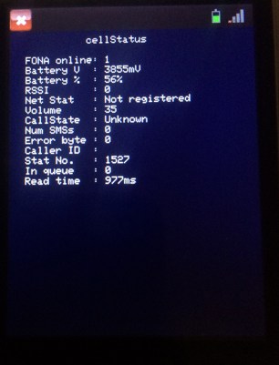
I’m thinking I’ll always need one of these. But it should be hidden under something else. It would be nice to have a real setting panel. Along with a panel that would show me a file listing from the SD card.
Also the time it takes to get a status block back from when asked. Look, you can see 977 ms. What the heck. What I’m I doing wrong here?
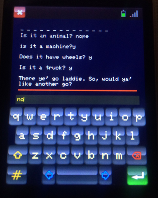
Again, scrolling. I don’t even know if I enable scrolling on this at all. Never actually looked.
I do have the source code for the old Star Trek text game. Might be fun to setup a panel like that.
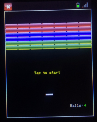
Sounds would be nice! Scoring as well as high scores.
So what’s in line for the future of this?
Its tough to say. The important bit has always been the library development. I’m thinking what the libraries need most is the concept of a clipping rectangle for drawing. This would make things like popup dialog boxes feasible. Another would be dealing with the entire scrolling and dragging issue. That may be a big deal, or I may find one of those “Doh! how blind was I when I wrote this?” Kinda’ things. I’ve not had time to look yet.
Oh! The code, almost forgot.
For the brave at heart : https://github.com/leftCoast/Arduino
Cellphone IV goes in the FeatherFONA.
Cellphone VI goes in the Teensy 3.2
In the library you’ll want folders that start with LC_ I don’t know the set yet.
The 3D files for the case : https://www.thingiverse.com/thing:4343098
Good luck!
Next : Don’t know..
